Thursday 6 March 2014

Questions To Apply To My Cover

Q1) What two conventions have i used and why?
I have taken a photo of a woman, who is staring directly at the camera, so the person who looks at it, feels as if the model is staring directly at them. This appeals massively to the reader, as a person is easily attracted to someone if you make eye contact with them. It makes the audience feel special and important, as if they know the person personally. 
Another convention i have used is that my magazine is neat and structured and is aesthetically pleasing to many young women. Young teenage women are particularly known to want everything tidy and clean, so therefore using this allows more younger women to be attracted to the magazine.

Q2) What are the effects of my Layout, Typography, Colour Choice and Language Choice?
My layout which i have put on my magazine cover, is very structured and orderly placed. This appeals to the target audience of teenage girls, as they appreciate ordered and neat furnishings. The typography used, is very attractive to teenage girls, as the title text is curved and elegant which is attractive to women.

Thursday 13 February 2014

Colour Connotations

The colour orange suggests that it is a vibrant yet mature magazine. The white clothing and background suggests that it is peaceful magazine, as if it is advertising a peaceful home. The blue advertises a sort mature vibe to it.

The dark red gives off a masculine mature feel to it. The blue gives off a mature feel to it.

RED

This work is incomplete. Please go back and finish the work.


Tuesday 4 February 2014

10 Titles and Cover Titles


1) POSE: WAYS TO LOOK GOOD IN WINTER
2) VIBRANT: BIEBER BEHIND BARS
3) BEAUTY: NEW WAYS TO BE YOURSELF
4)YOU: KIM K REVEALS LOVE LIFE
5) HER: ALL LATEST GOSSIP FROM HOLLYWOOD
6) LIPSTICK: GREY IS NEW HAPPY
7) SUPER: DIRTY DRE
8) Heaven: PEACE AT HOME THIS CHRISTMAS
9) FUN: ALL NEW PLACES TO GO FOR SUMMER
10) FRESH: CUTE DRESSES FOR SUMMER


Thursday 16 January 2014

Balance Powerpoint

The background is symmetrical because the background is the same colours. However the foreground is Asymmetrical as there is bright colours on one side but dark colours on the other.
Although asymmetrical balance may appear more casual and less planned, it is usually harder to use because the artist must plan the layout very carefully to ensure that it is still balanced.
Value refers to the lightness or darkness of objects.
Large flat areas without much detail can be balanced by small irregularly shaped objects since the eye is led towards the more intricate shape.
Using a balance beam, a larger weight closer to the centre point, can be balanced by a lighter weight further away from the centre. This is the basis for balance by position.
Smaller areas with interesting textures(variegated light and dark, or random fluctuations) can balance larger areas with smoother, untextured looks.
Your eye can be led to a certain point in a picture depending on how the elements are arranged. If the people in the picture are looking in a certain direction, your eye will be led there as well.
The third type of balance is radial balance, where all the elements radiate out from a centre point in a circular fashion. Because all the musical instruments surround his face.

GREEN

Really good piece of work with the right amount of detail and analysis. Well Done.

Monday 13 January 2014

Typography

Serif is a small line attached to the end of a stroke in a letter or symbol,such as when handwriting is separated into distinct units for a typewriter or typesetter.

Sans Serif is one that does not have the small projecting features called serif at the end of strokes.

Modern Font: I have chosen this font because the letters are very thin, and many people in the modern world want to be thin, so it fits in perfectly.


Kids Font: I have chosen this one as most of the letters aren't straight, so a lot of children don't have the neatest writing, so this fits in.

Sport Font: I chosen this one as the letters are slanted as if you are watching the letters go by very fast. A lot of sports are fast paced so it fits.
Masculine Font: I chose this one as the letters are pointed and the vertices of the letters aren't curved so it looks more like a masculine type of font.
Feminine Font: I have chosen this font as the letters have curved edges, and aren't pointed or jagged. This suggests that when you look at it to be a feminine font.
History Font: I have chosen a Greek font for my History font as it is traditional and classic. 

Sophisticated Font: I have chosen this font because it is very formal looking, and it is a font you would expect to get in a letter from the Queen.
Bold Font: I have chosen this one as it definitely bold, and is very striking so it attracts the reader.

Tuesday 7 January 2014

Lifestyle Magazine Covers

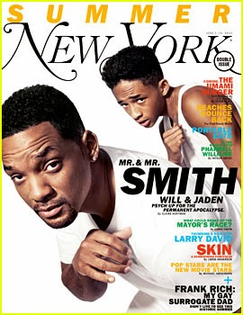
 Here is the front cover of Vogue magazine. The celebrity on the front cover is Kristen Stewart, a popular American Actress. The main colour is white, which could mean light, goodness, or innocence. This could mean that the magazine is a sign of goodness appealing to women. Kristen Stewart is looking directly at the camera, into the readers eyes. This appeals many people as it aspires people to look like this. The body position is very seductive attracting people. The layout is very ordered, with the more important stories in the bolder, bigger font. The magazine title is behind the celebrities head, so that when the reader looks at the title, they look straight into her eyes. The language used is very informal meaning that it appeals to people who don't work, as they don't really want to be reading log, complicated language. The font is mostly medium size, but there are some pieces which are big and bold, which can connote that they are the bigger stories to read.The magazine probably appeals to older women.
Here is the YM magazine. The colours are very pink and vibrant. This gives off the immature, silly and girlish vibe. It obviously appeals to teenage girls more. The celebrity on the front is Avril Lavigne, a popular American singer. The layout is usual to many magazines, sentences down every side, the more important stories are in bold writing, meaning they are the biggest stories for teenage girls. The language is very informal, appealing more to teenage girls. There are a lot of sentences saying things like,'Get Sexy, Shiny Hair', appealing to girls as they want to look perfect. The font is very bold, so it stands out more.


This is Time Magazine. The colours here are deep red, meaning seriousness. This could connote that this is for business men/women who want to know what is going on in the world. The layout is much more organised and sophisticated than other magazines. This appeals more to an older, business person. The celebrity on the front cover is Barack Obama, the president of America, perhaps the most important person in the world. This once again appeals to business men as they want to know about him. There are news headlines such as 'Nuclear Rogues and how to Control Them'. This is more appealing to people who want to know about politics and topics such as that. The font is much more basic than the rest, so it appeals to more laid back people. The language used appeals to more sophisticated city workers, as it talks about the president.


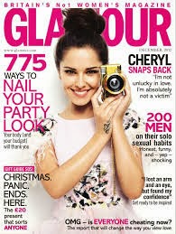
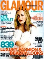
This is Glamour Magazine. The main colours are pink and white. The colour pink connotes the typical girlish vibe once again. This probably appeals to teenage girls again. The language used is very informal, and slang. Such as ' Cheryl Snaps Back' this probably appeals to more younger girls. The layout is messy, and not a lot of it would make sense if you put it in a novel. She is staring into the camera meaning that it appeals more to viewers.


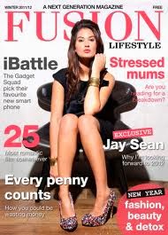
Here is Fusion magazine. The main colours here are red and white. The colours red show that this is a passionate magazine, mainly for women as the font is very sophisticated and is mainly viewed by women. The language used is more formal than magazines such as Glamour, as the language used includes things like: "The gadget squad pick their favourite new smart phone." This shows that the magazine is aimed at older women, as smart phones are mainly used business people. The layout is very ordered and it looks like time has been taken to make sure that you can see all the info and stories being shown.