Thursday, 6 March 2014

Questions To Apply To My Cover

Q1) What two conventions have i used and why?
I have taken a photo of a woman, who is staring directly at the camera, so the person who looks at it, feels as if the model is staring directly at them. This appeals massively to the reader, as a person is easily attracted to someone if you make eye contact with them. It makes the audience feel special and important, as if they know the person personally. 
Another convention i have used is that my magazine is neat and structured and is aesthetically pleasing to many young women. Young teenage women are particularly known to want everything tidy and clean, so therefore using this allows more younger women to be attracted to the magazine.

Q2) What are the effects of my Layout, Typography, Colour Choice and Language Choice?
My layout which i have put on my magazine cover, is very structured and orderly placed. This appeals to the target audience of teenage girls, as they appreciate ordered and neat furnishings. The typography used, is very attractive to teenage girls, as the title text is curved and elegant which is attractive to women.

Thursday, 13 February 2014

Colour Connotations

The colour orange suggests that it is a vibrant yet mature magazine. The white clothing and background suggests that it is peaceful magazine, as if it is advertising a peaceful home. The blue advertises a sort mature vibe to it.

The dark red gives off a masculine mature feel to it. The blue gives off a mature feel to it.

RED

This work is incomplete. Please go back and finish the work.


Tuesday, 4 February 2014

10 Titles and Cover Titles


1) POSE: WAYS TO LOOK GOOD IN WINTER
2) VIBRANT: BIEBER BEHIND BARS
3) BEAUTY: NEW WAYS TO BE YOURSELF
4)YOU: KIM K REVEALS LOVE LIFE
5) HER: ALL LATEST GOSSIP FROM HOLLYWOOD
6) LIPSTICK: GREY IS NEW HAPPY
7) SUPER: DIRTY DRE
8) Heaven: PEACE AT HOME THIS CHRISTMAS
9) FUN: ALL NEW PLACES TO GO FOR SUMMER
10) FRESH: CUTE DRESSES FOR SUMMER


Thursday, 16 January 2014

Balance Powerpoint

The background is symmetrical because the background is the same colours. However the foreground is Asymmetrical as there is bright colours on one side but dark colours on the other.
Although asymmetrical balance may appear more casual and less planned, it is usually harder to use because the artist must plan the layout very carefully to ensure that it is still balanced.
Value refers to the lightness or darkness of objects.
Large flat areas without much detail can be balanced by small irregularly shaped objects since the eye is led towards the more intricate shape.
Using a balance beam, a larger weight closer to the centre point, can be balanced by a lighter weight further away from the centre. This is the basis for balance by position.
Smaller areas with interesting textures(variegated light and dark, or random fluctuations) can balance larger areas with smoother, untextured looks.
Your eye can be led to a certain point in a picture depending on how the elements are arranged. If the people in the picture are looking in a certain direction, your eye will be led there as well.
The third type of balance is radial balance, where all the elements radiate out from a centre point in a circular fashion. Because all the musical instruments surround his face.

GREEN

Really good piece of work with the right amount of detail and analysis. Well Done.

Monday, 13 January 2014

Typography

Serif is a small line attached to the end of a stroke in a letter or symbol,such as when handwriting is separated into distinct units for a typewriter or typesetter.

Sans Serif is one that does not have the small projecting features called serif at the end of strokes.

Modern Font: I have chosen this font because the letters are very thin, and many people in the modern world want to be thin, so it fits in perfectly.


Kids Font: I have chosen this one as most of the letters aren't straight, so a lot of children don't have the neatest writing, so this fits in.

Sport Font: I chosen this one as the letters are slanted as if you are watching the letters go by very fast. A lot of sports are fast paced so it fits.
Masculine Font: I chose this one as the letters are pointed and the vertices of the letters aren't curved so it looks more like a masculine type of font.
Feminine Font: I have chosen this font as the letters have curved edges, and aren't pointed or jagged. This suggests that when you look at it to be a feminine font.
History Font: I have chosen a Greek font for my History font as it is traditional and classic. 

Sophisticated Font: I have chosen this font because it is very formal looking, and it is a font you would expect to get in a letter from the Queen.
Bold Font: I have chosen this one as it definitely bold, and is very striking so it attracts the reader.

Tuesday, 7 January 2014

Lifestyle Magazine Covers

 Here is the front cover of Vogue magazine. The celebrity on the front cover is Kristen Stewart, a popular American Actress. The main colour is white, which could mean light, goodness, or innocence. This could mean that the magazine is a sign of goodness appealing to women. Kristen Stewart is looking directly at the camera, into the readers eyes. This appeals many people as it aspires people to look like this. The body position is very seductive attracting people. The layout is very ordered, with the more important stories in the bolder, bigger font. The magazine title is behind the celebrities head, so that when the reader looks at the title, they look straight into her eyes. The language used is very informal meaning that it appeals to people who don't work, as they don't really want to be reading log, complicated language. The font is mostly medium size, but there are some pieces which are big and bold, which can connote that they are the bigger stories to read.The magazine probably appeals to older women.
Here is the YM magazine. The colours are very pink and vibrant. This gives off the immature, silly and girlish vibe. It obviously appeals to teenage girls more. The celebrity on the front is Avril Lavigne, a popular American singer. The layout is usual to many magazines, sentences down every side, the more important stories are in bold writing, meaning they are the biggest stories for teenage girls. The language is very informal, appealing more to teenage girls. There are a lot of sentences saying things like,'Get Sexy, Shiny Hair', appealing to girls as they want to look perfect. The font is very bold, so it stands out more.


This is Time Magazine. The colours here are deep red, meaning seriousness. This could connote that this is for business men/women who want to know what is going on in the world. The layout is much more organised and sophisticated than other magazines. This appeals more to an older, business person. The celebrity on the front cover is Barack Obama, the president of America, perhaps the most important person in the world. This once again appeals to business men as they want to know about him. There are news headlines such as 'Nuclear Rogues and how to Control Them'. This is more appealing to people who want to know about politics and topics such as that. The font is much more basic than the rest, so it appeals to more laid back people. The language used appeals to more sophisticated city workers, as it talks about the president.


This is Glamour Magazine. The main colours are pink and white. The colour pink connotes the typical girlish vibe once again. This probably appeals to teenage girls again. The language used is very informal, and slang. Such as ' Cheryl Snaps Back' this probably appeals to more younger girls. The layout is messy, and not a lot of it would make sense if you put it in a novel. She is staring into the camera meaning that it appeals more to viewers.


Here is Fusion magazine. The main colours here are red and white. The colours red show that this is a passionate magazine, mainly for women as the font is very sophisticated and is mainly viewed by women. The language used is more formal than magazines such as Glamour, as the language used includes things like: "The gadget squad pick their favourite new smart phone." This shows that the magazine is aimed at older women, as smart phones are mainly used business people. The layout is very ordered and it looks like time has been taken to make sure that you can see all the info and stories being shown.

Tuesday, 17 December 2013

Magazine Cover Review

Here is the cover of Mens Health. It is will be aspirational to some people as it tells on the front cover things like 'Drop 5KGS Now!'. This will attract men into their magazine with slogans like 'Double Muscle'. The target audience for the magazine is men in their 30's, as there are things like diet techniques on the front. 'Fitter, Leaner, Richer'. The magazine expects it's target audience to learn techniques to lose weight. It tells you on the front cover things like 'Press here for explosive sex!', 'Best foods for men'! These tell you things about private life, and how you can improve them.


Here is the Cosmopolitan front cover. This will be aspirational to some people, as it tells people to 'Love your Body'. These slogans make women attracted to the magazine. The target audience for the magazine is women in their 30's. It tells people a lot about losing weight such as :'Too fat? Your Body Demons'. Many women at this age are cautious about their weight. The values the magazine expects the readers to have is to improve their life. It tells you a lot about sex and how to improve it. The magazine is saying that you need to look at this, otherwise you are not normal.
The tone of the magazine is aspirational as there is vibrant colours, and a women staring at you. The target audience for this magazine is 18-20 year old women, you can see this with things like 'You=A*flirt!' A* referring to school grades. There are many things to do with school such as 'Celeb School Confessions', 'Classmates need to mop up my periods'. This can show that they want to teenage girls to grow up like this, with all the latest fashion, and have lots of glamour, and to gossip.

Here is the front cover of Attitude magazine. The cover is aspirational, as it is included with many things such as vibrant colours and a male celebrity on the front. The magazine is aimed at gay men. You can see this because it has a blue background aimed at men, however it says. 'Obsessed with a guy?'

Monday, 16 December 2013

FHM Editors Notes Review


Publication: FHM
Issue: February 2005

The standard model “guy” is a pretty straightforward being. When we tell our lady to shut her trap so we can watch some footie, it means just that. There are no hidden messages whatsoever. And it certainly does not mean, “Honey, now is the best time to talk about where this relationship is going.” But as we’ve stressed oh-so-many times in the pages of this very magazine, women on the other hand, are not so much into this business of being straightforward. The word “fine” for example, could mean a million and one things, and it is way better to have all your limbs chopped off by a mega-powered chainsaw than have a woman say the dreaded word to you.
So this month if your girl mutters, “We don’t really need to celebrate Valentine’s Day if you don’t want to,” don’t take it as your cue to jump for joy and spend all the cash on Star Wars Lego. Why? Because there is simply no chance in hell that she actually means it, plus it will take you forever to build one stupid Millennium Falcon.
If anything, it’s simply a test to see if you’re really the sensitive and caring dreamboat that you’ve been pretending to be, or if you’re just, well, a guy. So what do you do? If you really dig the chick – and third base is a great possibility – we recommend you sell all your worldly possessions and spend it all on that one special day. And to help your cause, we’ve got some pretty good V-Day gift ideas on pages 98 and 99. After all, third base is a pretty damn good thing.

Chatty and Informal.
Direct mode of address

Thursday, 12 December 2013

Cosmopolitan Magazine Review


The Cosmopolitan Magazine has Jess Alba on the front cover. She is a famous model and celebrity. The magazine has put her on the front cover, to say that famous people like or read this magazine. This makes the readers think that the magazine is popular with famous celebrities, so it makes the person want to buy it. Jessica Alba is looking straight down the camera, so the reader will look right into her eyes. This makes the reader feel important, and they will want to buy the magazine. If the reader is looking at this, they think that they can become like this. When the magazine does this, they hope to attract more readers.


Direct address is used on the front cover of the magazine. The magazine is talking to you, and is making a direct address to your lifestyle. This Cosmopolitan Magazine says things like: 'Ways you're accidentally sexy',' Have you changed your bed sheets this week?',' Already in your Wardrobe',' How to find your orgasm every time'. This is used to make the reader feel as if this implies to them. It makes the reader feel as if they are the centre of attention. It makes the reader feel as if they can become like this if they want. When magazines do this, it has a massive effect on the target audience.


Monday, 9 December 2013

Introduction to Lifestyle Magazines

There are different types of content in magazines, such as: Health, Glamour, Marriage, Relationships, but mostly there are just adverts of perfumes, fashion and stores such as DFS. These all relate to women, and their lifestyles. When people look at this, it makes them feel that this is how a women should live. With things such as "Personal stylist party shoes, 10 ways to get happy, Marriage in crisis, sex drugs and yoga, love the skin your in, start losing weight." These are topics that appeal to women more than men, and are things that women want to have in their life such as good skin, losing weight, and acheive happiness in their life. 
The lay out of a lot of magazines are exactly the same. They usually have a woman, smiling happily at you on the front cover, in a bright coloured dress which you can buy at John Lewis for example. Either side of the woman there is writing of what you can expect inside the magazine such as things about how to keep your marriage together, and how to lose weight. They are set out in a tidy, orderly way, which is how women like everything. As you open onto the first page you get a double sided advertisement on perfume. Appealing to women. You turn the page and you get the contents page which explains everything interesting further. From then on you get a story, and then adverts until the end of the mag. From my analysis, the gender this appeals to more is women, especially in their mid thirties. This is because about then, women are usually getting married, and the age when they are concerned most about their weight. It tells women what should be most important to them.
Women would hope to benefit from buying this magazine, by hoping that it will change their perception of what they have to do in their life. They hope that it will keep their marriage together, and give them good tips on how to find men.

Thursday, 5 December 2013

Album Cover Connotations


Here is Rihanna's album cover of Loud. On the cover is a close-up picture of Rihanna. She is wearing red lipstick, with dyed red hair. This could show that the album is vibrant and colourful, with up-beat songs. Red is associated with blood and war, so this could connote that the album is energetic. She is wearing ear rings as well to say that she is wealthy. The tattoo could also mean this. Her face is captured in a seductive way, meaning that is also being aimed, not just at teenage girls, but at man also.


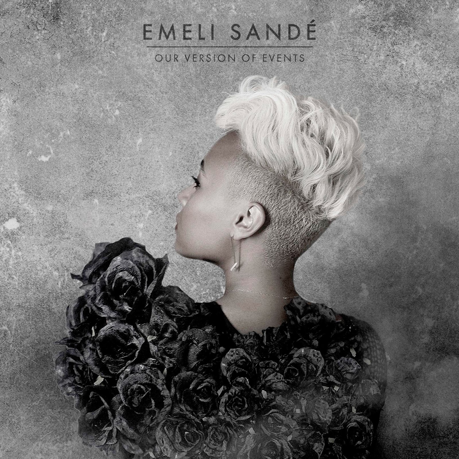
Here is Emeli Sande's album cover of Our Version Of Events. Here there Emeli facing backwards from the camera and looking over her shoulder. It could mean that she is looking back at her past. On her back there are black roses, looking dead. This could mean that in her past there has been death. There is a dull blank background, possibly meaning that ahead of her there is still more sadness. Her hair is grey, but her face is young, meaning that she is feeling old and deprieved. She has cheap ear rings, meaning she does not have much money left. 

Here is Bruno Mars' album cover for Unorthodox Jukebox. Here there is an ape or gorilla, over an old and dilapidated Jukebox. In the background there is nothing, except a dull white background. The Gorilla seems to be standing up, which could mean that he looks stupid, but actually on the outside he is clever. However the Jukebox is old, which could mean that it is out of fashion, and not popular anymore. The gorilla could mean that people who listen to Jukebox's are stupid and old-fashioned.
Here we have Michael Buble taking off his tie with a orange background. He is looking very seductively away from the camera, and is taking off his tie. This could mean that he is looking at a women and fantasizing about her. I think that he is a womanizer and looking for a woman. The orange could give a happy atmosphere to the song.

Here there is Rod Stewart walking along a beach with a guitar. His Guitar could show his love of music. The way he is walking on a beach, could mean that it is a very relaxed album, with soothing songs. He is looking out to sea and that could mean that the sea to him is peaceful, or maybe he just likes the sea. The text of Rod Stewart's name, is in a very laid back sort of tone. He is dressed in a leather jacket, to show that he is cool or happy.

Here is Jake Bugg's album cover. It is a black and white picture, of him looking depressed. This could mean that he is sad in his life, and that the songs in the album are sad, and depressing as well. In the background there looks like the front of an old house. This could mean that he came from a poor background. He wearing a jacket to keep himself warm, suggesting that the feeling in his life is cold.

Here is the album cover for the Arctic monkeys album :AM. It is a piece of minimalist artwork, looking like a thing that measures sound waves. This could mean that they have an energetic sound to their music. There doesn't seem to be anything else in the background, so the album must just be about the music.
Here is Bastille's album cover for Bad Blood. Here there is a man running away on a road, being illuminated by car lights. This could mean that he does not like the people he is running from, meaning that he wants to get away from them. The background is in darkness, meaning that he is running from the light and into the dark.
Here is Daft Punks album called Random Access Memories. There is two half masks put together to look like one mask. There is nothing in the background, so it suggests that the album is just about them. The masks are shining, meaning that they are shining are the best. This can also give off the impression that they are rich due to the shining masks. The masks also look futuristic, which gives off the sense that they are a techno duo. 


This is the eponymous album of Rage Against the Machine. The cover shows a supposed man on fire, he doesn't look bothered about it so he is probably self-immolating. Self-immolation usually occurs when people are protesting about a certain subject. The band, Rage Against the Machine, are probably using this mans sacrifice to protest about a subject. This man was protesting about the way Tibet was run by the Chinese. RATM are probably using this to protest about the government. The picture is in black and white, which can give off a sad, melancholy vibe to the album.


Wednesday, 20 November 2013

Women represented in positive and negative way

Candy Shop by 50 Cent

A lot of the actors are represented in a bad way such all of them being almost half naked. Numerous costumes that actors are wearing are originated from pornography, such as the women dressed as a nurse, seductively dancing over 50 Cent.
Without Me Eminem

Here Eminem is basically saying that he is in charge of everything. Here he takes control of the women, and treats them like animals. He talks about how he hops from one woman to the next, and just does it for a laugh.


Man Down Rihanna

This shows Rihanna walking around a Caribbean village, greeting the locals into her home, and refusing to dance with a man who also wanted to take her home. She sings about how she is an independent woman, and wants to make the own choices in her life.


Grading

1/12

D1

You have a number of good points here and have chosen your examples well, but you don't really have any specific examples to back up your points made.

T: Find examples and apply them to your chosen videos to help you fully explain your points.

Thursday, 24 October 2013

Advanced Skill On Photoshop

How to get Birds Eye View:

1: When zoomed in, press and hold the H Key on your keyboard.
2: Click and drag your mouse to temporarily zoom out to a birds eye view. When you let go you'll zoom bak into the level you were working at

Grading

1/12

RED

This isn't really finished and you don't really explain how you perform the task here.


T: Please finish this task fully explaining how you use the tool using step by step images.

Thursday, 10 October 2013

EBI and WWW on presentation


WWW: We did not use any words on the powerpoint just pictures so we improvised, which is hard to do.
Also we made the colour stand out with bright red

EBI: We could maybe have put in a few more words, such as ideas that we thought up in our heads when we were making the presentation, e.g Light, Bright, Dancing, Shirts, Blouse.

Overall, I think our presentation was a success

Thursday, 3 October 2013

50 Cent Candy Shop

Women representation in music videos.
In 50 Cent's candy shop video, at the beginning you can clearly see he driving in a Ferrari. Immediately you can see that it is a very rich person driving into the mansion, in a ferrari. As soon as he enters the mansion there is half dressed women, looking very seductive at 50 cent as though all of them know 50 in their own ways. This supports the idea that to be a man you have to be rich with lots of women. The lyrics also support this idea.

As soon as he walks into a room there is girl half naked, on a bed. 50 seems to like this and joins her on the bed...

The women is acting very seductive, and is liking the way that 50 is touching her. The lyrics give the message that he is a real man. Immediately afterwards he is with another woman. This shows that he is a slut and doesn't care if he gets an STD. Then afterwards there is a dance routine, showing 6 women dancing around. Again this shows that the people don't care what they do. There a lot of people gyrating their hips.

In the next scene, there is 50 standing in front of women disguised as ancient artefacts. This can show that he has been around for a long time, and to show that everyone likes him.

Then there is another person standing there half naked with a whip. She takes off 50's top and invites him to join her in the bed. Then we see 50 sitting on ferrari. This once again shows that he is rich, and to be a man you have to be this.


All in all, the video does support the statement given

Hip Hop does suggest a rigid and narrow version of Manhood. As apparently to be 'A Man', you have to lot's of girls and fast cars such as Ferrari's. He presents this in the video and in the lyrics he says. In the lyrics he talks about having fast cars and being dominant over the women he has. Also in the lyrics, he talks about that if you do not have these things, you are considered not being man enough. With these videos like this, it will influence young men to think that this is the right way to grow up, which I think is wrong.

Tuesday, 24 September 2013

Logo Evaluation

My final image looks a lot like a posh school for secondary school students, overall I am happy with it as I managed to create it myself and it is the first time I have used Photoshop. The font I used suggests that the school is very posh meaning a public school, which explains that it has wealthy families. I chose a posh font as it fits in with the idea that it is a traditional school. The image I used fits the theme perfectly and I'm pleased I managed to crop and centre it to fit in the logo. The overall effect is pretty good.

For my image to be improved I could have added colour to make the picture stand out more, or added a border. The border could make the person looking at the logo centre in on the logo itself, so it makes the logo important. In order to improve I will have to practise on Photoshop more.

Thursday, 19 September 2013

Harrow school


The logo is for a school show. The type setting for the show is a posh , traditional in North London. The type of characters in the show will be quite rich, posh students as they can afford to go to a public school. The show is a reality show, so the show will be about how they cope in the school that is very different from all other schools.

I first of all made the logo in Photoshop, I copied and pasted the logo onto Photoshop. Next I used the Square tool to draw around the logo. Finally i added in the paint tool to make the outline of the photo.


I rate my final logo 5/10. i hope that people will understand that the logo is meant to basic and quite posh, because the school is represented this way. When my skills improve, I hope that I will be able to add on better font,(I'm sorry you can't see the title),for my title. Also, I hope i can make the logo more out-standing, such as adding in more colour. Also, adding more features, such lighting.