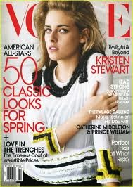
Here is the front cover of Vogue magazine. The celebrity on the front cover is Kristen Stewart, a popular American Actress. The main colour is white, which could mean light, goodness, or innocence. This could mean that the magazine is a sign of goodness appealing to women. Kristen Stewart is looking directly at the camera, into the readers eyes. This appeals many people as it aspires people to look like this. The body position is very seductive attracting people. The layout is very ordered, with the more important stories in the bolder, bigger font. The magazine title is behind the celebrities head, so that when the reader looks at the title, they look straight into her eyes. The language used is very informal meaning that it appeals to people who don't work, as they don't really want to be reading log, complicated language. The font is mostly medium size, but there are some pieces which are big and bold, which can connote that they are the bigger stories to read.The magazine probably appeals to older women.

Here is the YM magazine. The colours are very pink and vibrant. This gives off the immature, silly and girlish vibe. It obviously appeals to teenage girls more. The celebrity on the front is Avril Lavigne, a popular American singer. The layout is usual to many magazines, sentences down every side, the more important stories are in bold writing, meaning they are the biggest stories for teenage girls. The language is very informal, appealing more to teenage girls. There are a lot of sentences saying things like,'Get Sexy, Shiny Hair', appealing to girls as they want to look perfect. The font is very bold, so it stands out more.

This is Time Magazine. The colours here are deep red, meaning seriousness. This could connote that this is for business men/women who want to know what is going on in the world. The layout is much more organised and sophisticated than other magazines. This appeals more to an older, business person. The celebrity on the front cover is Barack Obama, the president of America, perhaps the most important person in the world. This once again appeals to business men as they want to know about him. There are news headlines such as 'Nuclear Rogues and how to Control Them'. This is more appealing to people who want to know about politics and topics such as that. The font is much more basic than the rest, so it appeals to more laid back people. The language used appeals to more sophisticated city workers, as it talks about the president.

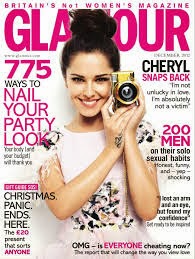
This is Glamour Magazine. The main colours are pink and white. The colour pink connotes the typical girlish vibe once again. This probably appeals to teenage girls again. The language used is very informal, and slang. Such as ' Cheryl Snaps Back' this probably appeals to more younger girls. The layout is messy, and not a lot of it would make sense if you put it in a novel. She is staring into the camera meaning that it appeals more to viewers.

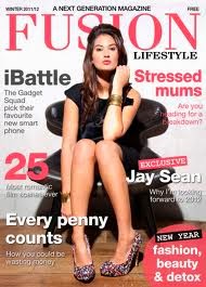
Here is Fusion magazine. The main colours here are red and white. The colours red show that this is a passionate magazine, mainly for women as the font is very sophisticated and is mainly viewed by women. The language used is more formal than magazines such as Glamour, as the language used includes things like: "The gadget squad pick their favourite new smart phone." This shows that the magazine is aimed at older women, as smart phones are mainly used business people. The layout is very ordered and it looks like time has been taken to make sure that you can see all the info and stories being shown.
